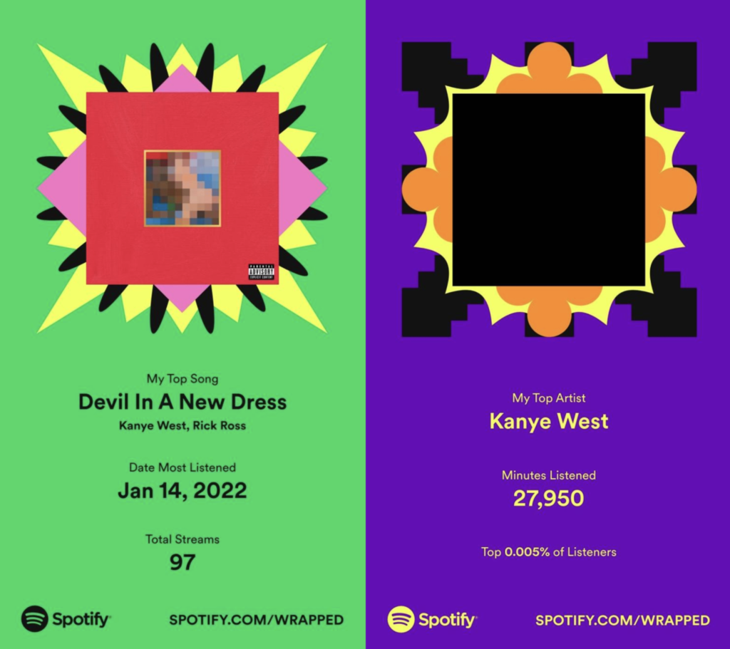
I eagerly opened the Spotify app on my phone on a cold November morning to see my musical landscape of the past year. Unsurprisingly, Kanye West was my most played artist (disclaimer: I am a fan of the music, not the person) and my favorite song, “Devil In A New Dress,” had the highest number of plays at 93.
Spotify Wrapped is a presentation in a similar style to Instagram Stories, released on Nov. 30 every year, that summarizes the user’s top artists, songs and genres throughout the year. Although it was nice to see this in a visually appealing and easily digestible manner, most of it was information I already knew.
What was most interesting to me was the few concrete statistics Wrapped provided. It informed me that I had listened to Kanye for 27,950 minutes, or around 1.5 hours on average daily, placing me in the top 0.005% of listeners. However, having access to additional numbers such as how many times I listened to a playlist or my global listening ranking for my top five most-played songs would have also been nice. I especially wanted to see what percentile I was in for the most “Devil In A New Dress” plays.
In light of all the recent controversies surrounding Kanye, I’ve been trying to expand my music taste and stop exclusively listening to him. This brings up another potential change: Wrapped could add a month-by-month overview of the user’s top artists and songs to illustrate their musical evolution. This way, Wrapped would be a collection of time capsules for the previous months. The first time I listened to “AT.LONG.LAST.A$AP” by A$AP Rocky months ago was an absolutely incredible 66 minutes. A way to remember those kinds of experiences is sorely needed.
Some more technical information may also be useful. Spotify could tell users how long their average listening session was and what time they tended to listen to music. To help users save time by trimming down their playlists, Wrapped could say which songs were most likely to be skipped.
Though the Spotify following feature is neglected, Wrapped could compare users’ music tastes with their followers and the people they follow. This could help users connect with their friends over music if they share a favorite album or artist, and introduce them to new music because people are probably more likely to trust in the music taste of their friends than the awful spotify recommendation algorithm.
Finally, one thing that annoys me to no end is the animation that plays before each slide. Sure, it contributes to the aesthetic that Spotify wants to create, but after the first viewing of Wrapped, it just wastes time. If I’m trying to find a specific statistic, I have to wait a few precious seconds to see if the slide I’m on is the correct one.
Wrapped is currently an underwhelming collection of obvious statistics that do not provoke much thought. With a few simple changes, it could become a gift worthy of the holiday season.


