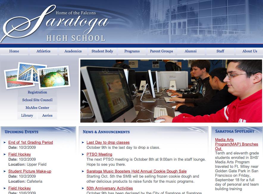
The school has been taking great strides in improving the look and feel the campus by constructing new buildings and beautifying different spots. However, one major improvement that involved no bulldozers or noisy jackhammers this summer was the revamping of the school’s website (www.saratogahigh.org).
Many students were caught by surprise when they logged onto the site this fall and came across a new and improved interface. The new website, along with being less modular and more attractive, includes new features such as a search, the capability of having web television, transitioning pictures of the campus and students on the homepage, built in e-mail, an active calendar and tech support 12 hours a day.
“The transitioning pictures were definitely the first thing that caught my eye,” said sophomore Eric Wang. “The colors also make the site more attractive and modern looking.”
A team of teachers, staff and administrators worked with Educational Networks to create the most user-friendly website possible. Media arts teacher Tony Palma was a part of this team.
“We worked with the service we chose to develop the basics of the site,” said Palma. “We also tried to make it easier for everyone to have access, not just the webmaster.”
Also, with the new design, all teachers and staff can now modify their own part of the website.
Judging by the early reaction, the redesign has been a success.
“Right when I enter the site I feel so much more welcome,” said Wang. “The way the website is presented also makes our school look better as a whole.”

