With the rise of TikTok and the typical chokehold Pinterest has on some (or most) of our lives, people have become focused on aesthetics more than ever. We aestheticize everything! Our wardrobe, our social media presence, our very rooms, and there is no aesthetic trend more infamous in their miniscule nature, in their tedious upkeep and their relevance to teenage lives, than the aesthetic phone home screen.
As someone who is committed to the aesthetic bit but still needs my phone to actually be usable, I have committed myself to scrounging up some tips that might be useful to you on your endeavor. (Your glam-deavor, if you may.)
1. USE FOLDERS!!!!!
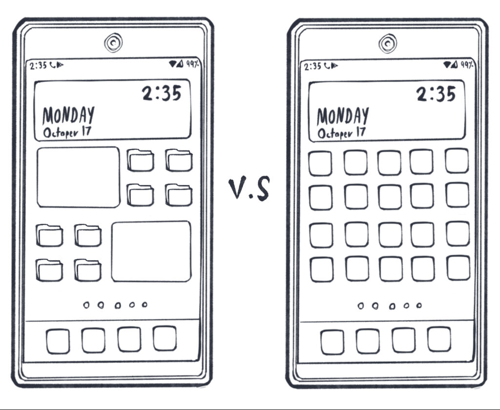
The most important thing I’d recommend in terms of organization is that, if using folders would fit into your aesthetic, ALWAYS USE FOLDERS.
Especially if you’ve changed the icons of your apps and are having trouble remembering which apps are which, I recommend putting them in relatively small folders sorted by type (e.g., video games, social media), or by the places you’re most likely to use them (e.g., school, home, extracurriculars, etc.). This will make it MUCH easier to memorize which app is which.
I also recommend sticking to about four to six apps per folder, and make sure to always name the folder itself. That way, whenever you have to find an important app, all you’ll have to remember is something like “oh, it’s in the ‘school’ folder in the top left corner,” and it’ll make your search a lot easier.
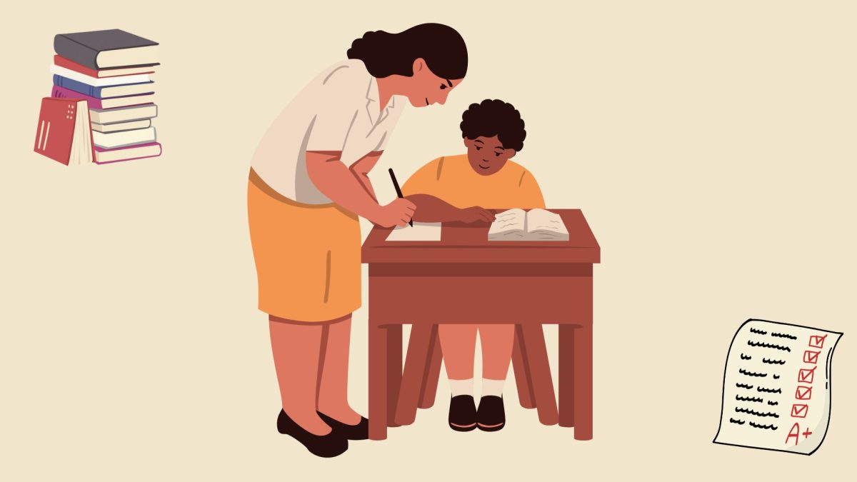
Graphic by Jex Sammael Popov
Organization is key!
2. Muscle memory is your friend!
If you decide to go down the route where you change your phone layout by specifically adding themed app icons, it’s important to give yourself enough time to engrave the new layout into your muscle memory so you don’t have to rely on the visual cues of the app logo.
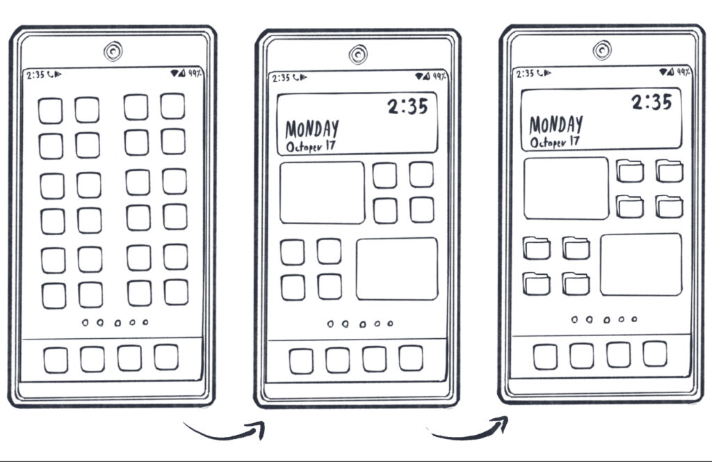
I personally suggest starting out with a complete idea of what you want your phone layout to look like by sketching it quickly on paper. Then, start to gradually shift your phone layout to match it, starting with any widgets since they push all the apps around.
Graphic by Jex Sammael Popov
The slow process to greatness.
3. App icons and wallpaper should be chosen together
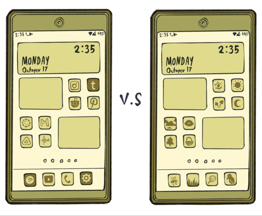
By the way, if you’re having specific trouble with memorizing the new themed icons, try switching the app icon to a simplified version of itself that matches your phone’s color scheme. Specifically, if your wallpaper is lighter, try to get your app icons to be a little darker so they’d stand out with just a single glance and vice versa.
Graphic by Jex Sammael Popov
My phone does this automatically haha.
(For those who aren’t as lost in the sauce to this “aesthetics” stuff as I am, one typically changes their phone app icons via downloading an app specializing in phone screen customization and actually downloading a new icon through it.)
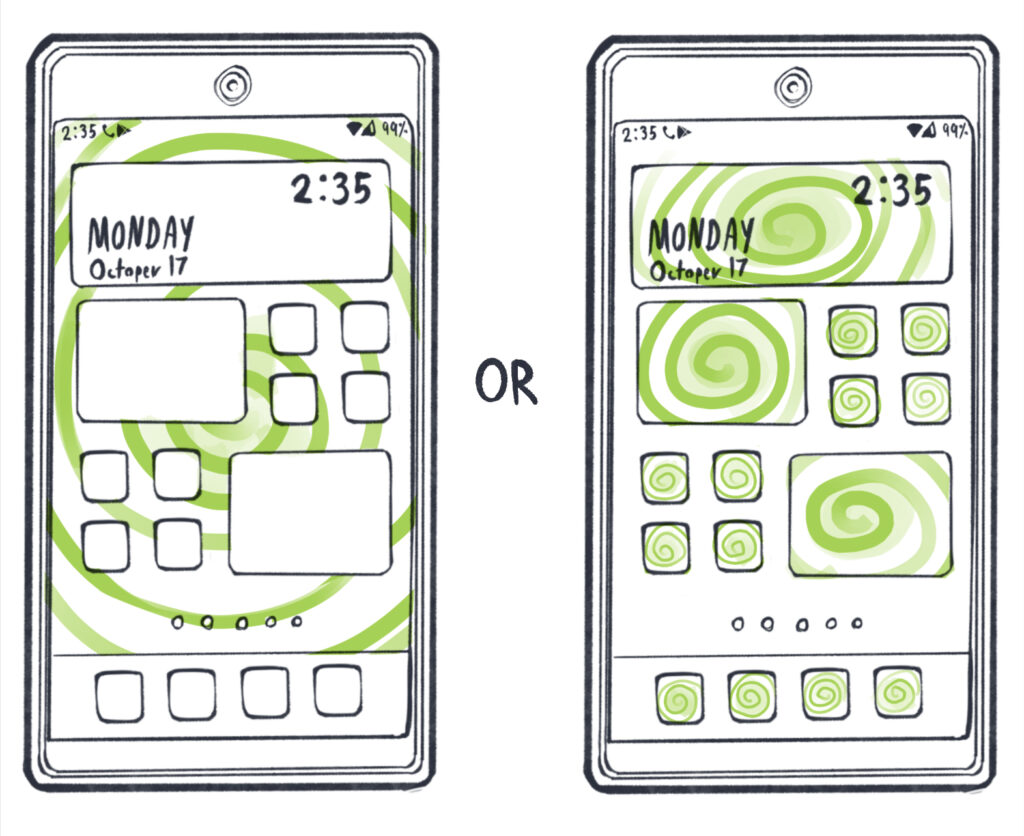
Keep in mind what you want to stand out more in terms of detail — your apps or your background. If you have very detailed app icons on top of a very detailed background, you’ll basically just have a seizure every time you look at your phone.
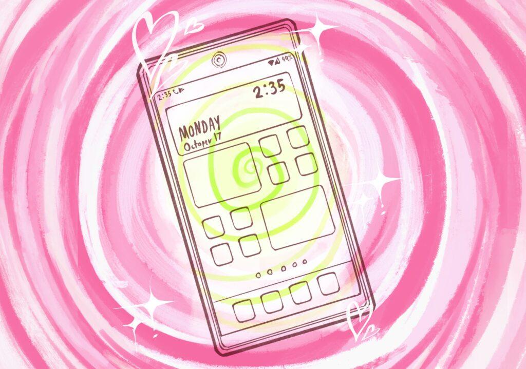
Graphic by Jex Sammael Popov
You’re getting sleepy…. Your eyelids are getting heavy….
And last of all — have fun with it! Remember, you dictate the aesthetic, so don’t let the aesthetic doesn’t dictate you. You should go off and decorate your home screen to your heart’s content as long as it brings you joy.


