Over the summer, editors-in-chief seniors Manasi Garg, Allison Hartley, Rohan Kumar and Kaitlyn Tsai started to meet to discuss how they wanted to redesign the Falcon website, a change they wanted to make because they believed the website was out of date in terms of style and efficiency. With its lack of visuals and cluttered design, the site looked outdated in comparison to other student newspaper websites, such as The Voice from Palo Alto High School.
To make the website measure up with the quality of their print issues, the editors-in-chief and journalism teacher Michael Tyler turned to Jim Miller, a freelance website designer who has worked with The Falcon since 2008.
The six met three times since August to discuss the editors-in-chief’s vision for the website, which drew inspiration from a variety of high school and university publications, including The Muse from Alexander W. Dreyfoos School of the Arts and The Chicago Maroon from the University of Chicago.
The Falcon has had a website since 2001, but until 2008, it was completely student-run, according to Tyler. This caused significant problems because students would be very technologically proficient in some years but not in other years.
Since Tyler does not consider himself a web designer, he knew that they needed to get someone who could design the website and manage it for long periods of time.
“Ultimately, I found out about Jim Miller, and we started using him as our technical backbone to the website,” Tyler said. “The great thing was that with him and his level of expertise involved, he wasn’t going to graduate, and we could maintain the website over the course of a long period of time.”
Tyler considers Miller’s design a worthy investment; the $2,500 price was insignificant compared to the hours of work he and the editors-in-chief would have had to spend on revamping the website to its current form. He added that the Falcon could pay upwards of $1,500 for each print issue, so spending this amount one time for the redesign was a bargain.
While Miller was the one working directly on the website, Tyler attributes its new look to the editors-in-chief and their vision.
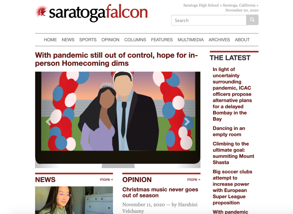
Their goal was to create a more modern, clean look and add more art and visuals to the site. Hartley also believed that the last site was somewhat “list-like”, so they worked to fix that appearance as well.
Kumar played an important role in re-designing the website as he created mockup designs to show Miller their vision for the website, which helped streamline the process for the website designer.
For the main changes to the website, the team focused on cleaning up and reordering what their website displayed. The opinion section, for example, now occupies a much larger portion on the front page, a change Tyler describes as necessary to best represent the newspaper.
“Opinion is more prominent in this site, which is more in keeping with the culture of the class,” Tyler said. “Now, it's equal with news, which is really good.”
The editors-in-chief and Tyler also focused on making the Falcon social media accounts — Instagram, Facebook, Snapchat, Twitter and YouTube — more noticeable and added a newsletter signup box to increase reader interaction, something Tsai said was especially important in the new online age of the pandemic.
Meanwhile, the team decided to bring less attention to their multimedia page, where they post all broadcasts of SHSTV, by making it into a tab rather than its own section on the homepage. Tyler attributes this change to the fact that media teams are not as large as they were in in-person learning.
Aside from these changes, the editors-in-chief, Tyler and Miller also worked on smaller touches such as making the “search by author” feature more prominent, adding art to every story and taking down the poll and photo of the week.
Although they may continue working on minor stylistic changes, all four editors-in-chief and Tyler are pleased with the new website, viewing it as a positive and necessary change.
“I don’t think there was anything wrong with the old website,” Tyler said. “I just feel like this is a nice upgrade and it kind of brings us up to date.”
To see the redesigned website, visit www.saratogafalcon.org.

