“Unit 7 Test graded: Click to view results here.”
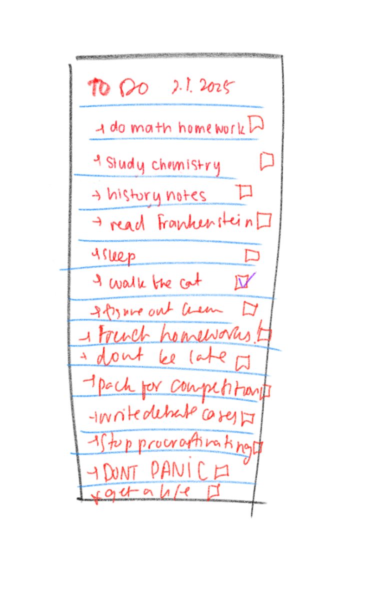
Oh my god. As soon as that notification appears on my phone, I breathe a quick prayer before frantically clicking on the popup that will tell me the score that basically determines my chemistry grade for the rest of the school year.
Unfortunately, Canvas, the school’s learning management system, doesn’t agree with my panic. The screen blanks dully, and eternity and several mental breakdowns pass before it finally decides to show me what I got.
What, did you think I’d tell you?
Aside from those familiar feelings of anxiety and stress that Canvas inflicts upon us all, there’s more to the app and website than it seems. I’m here to guide you through a visual tour of the different aspects that make up this life-saving platform.
1. Account
As soon as you click “Account,” five subsections appear: notifications, profile, files, settings and ePortfolios.
Actually, I lied. There are only four — no one actually changes their notification settings from the default ones, and even if you attempt to, then good luck trying to not have a seizure from looking at all that neon green.
The profile feature seems a bit redundant as well — can you believe the nerve of Canvas, thinking that I’d willingly upload a biography of myself? Why would I give Canvas more of my personal information when it already knows the most personal thing about me — my grades?
Files is basically a compilation of class modules but way more compact and way more confusing. Again: redundant.
To this day, I still can’t figure out what user settings are supposed to change, but if I’m ever bored, I know I can always change my Canvas settings that don’t matter. Seems a bit … useless, if I may say so myself.
Finally, there's the ePortfolios feature, which is basically a watered-down LinkedIn profile. This is where you can flex your academic work, but I’m not totally sure because I don’t have any achievements to flex anyway.
2. Dashboard
Here you can find all your joy-inducing classes in all their colorful glory. You can make nicknames for classes, change their dashboard colors and access your to-do list. That’s where I can see all the Zoom meetings I have to attend and my overdue assignments. Just kidding. Unless?
Pro tip: very few people actually know this, but Canvas has a secret exercise feature that can be found on the Dashboard. If you’ll notice in the bottom right of the page, there’s a “View Grades” button, which is a weird way of spelling “Start Sweating.” If you click on it, you’ll notice that your heart rate will suddenly increase, your body will begin perspiring and beads of sweat will be rolling down your face — or are those tears? Either way, it’s akin to a full workout.
Pretty neat feature, isn’t it?
3. Courses
This serves the exact same purpose as the dashboard in a more compact, less interesting version. Once you click on it, a drop-down menu showcases all the classes you mistakenly signed up for, including those from first semester that you somehow still mistakenly go to every time. No one is trying to see their previous classes anyway.
4. Calendar
To be honest, I haven’t used this at all. Some people have said it’s useful, but I just take photos of my teachers’ schedules. It’s satisfying to see your assignments crossed off, but after looking at my calendar, I’m only reminded of my overdue French homework. Even though looking at it makes me sad, this calendar will definitely save me for the rest of quarantine.
5. Inbox
Last week, I had 28 unread messages. Now I have 39. I don’t know what to say, or where they’re coming from. Those messages contain a mixture of ASB announcements, “VERY IMPORTANT CLASS ANNOUNCEMENTS,” upcoming school events and the occasional ASB election forms; somehow I read all of those, but when relevant announcements are actually sent out, I never do.
6. Studio
Apparently teachers can use this feature to record videos, but nobody uses it. Are you noticing a pattern with the usefulness of these features?
7. Help
Once you click on this icon, a smiling panda holding a map appears. I know it sounds terrifying, but I’m pretty sure it’s the cutest thing I’ve ever seen in my life. I love it with my whole heart.
Oh yeah, you can ask your teachers questions, report problems and even submit improvements to the site in the Help menu. You can also select how your problems are affecting you, ranging from “Just a casual question, comment, idea or suggestion” to “EXTREME CRITICAL EMERGENCY!” “I cannot get things done until I hear back from you” is my personal favorite.
8. Overall
The general theme is minimalistic with a nice red, gray and white color palette. Canvas is pretty organized, and it’s nice to see a special section for students to submit questions to their instructors or the Canvas support team. Though several sections are redundant and a little useless, I appreciate the flexibility to customize and explore. Overall, I’d rate it a 4.5/5 — I’m just docking 0.5 points because its icon bears too much of a resemblance to the coronavirus.
Was Canvas trying to warn us? Or is there a darker secret involved? We may never know.
It’s all good in the end, though: if you click on “Account” and this really cool “Logout” button, you can actually just leave Canvas and all those traumatizing memories behind.
Then, you can spend the next hour channeling positive vibes before you realize that you need to sign in again to finish history homework due at midnight.


